Walk through any city right now and you can feel it before you can name it. The chest-billboard era is over. The giant logo stretched across a hoodie, the name shouted in block letters so everyone on the block could read it from ten feet away — that flex has gone quiet.
It did not disappear overnight. Logomania ruled the late 2010s and the early 2020s, and the oversized hoodie was its uniform. But as 2026 has gone on, both have taken a back seat. In their place is something slower, stranger, and a lot more interesting: streetwear that rewards a second look instead of demanding a first one.
The flex went quiet
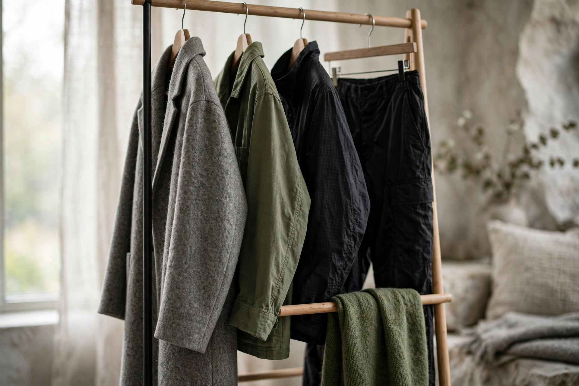
The new flex is texture. Heavyweight cotton that holds its shape. Brushed fleece. Ripstop that catches the light. A seam that sits exactly where it should. A garment-dyed finish that looks lived-in on day one, not washed-out by week three.
Subtle branding has not vanished — a small embroidered emblem here, a heritage insignia there — but the point is no longer to prove you bought the name. The point is that the piece itself is worth wearing. If you know, you know. If you do not, the fit still speaks for itself.
Built to work, not just to be seen
The other big move of 2026 is utility — quiet technical utility, not costume. Cargo pants with pockets that actually hold something. Utility vests. Technical shells and trail-inspired layers worn on the train, not just on a trail. Water-repellent fabrics, articulated seams, modular details. The gear looks ready for bad weather because it is.
The palette tells the same story. Forget neon brights. The current wave runs to mineral tones, basalt grays, moss greens, scorched earth, and deep obsidian blacks. Earth, stone, and shadow. It is a color story that layers without clashing and lets texture do the work color used to do.
The archive is open
At the same time, streetwear is looking backward to move forward. Neo-Y2K and archive revival are strong in 2026, and this time the nostalgia is more discerning than a simple throwback.
Younger creators are digging past the obvious early-2000s hits into late-90s and early-millennium skate culture, techno subcultures, and obscure athletic labels. The references are deeper, the cuts are updated, and the pieces are re-engineered for now — faded and distressed finishes on new garments, vintage sportswear colorways, Y2K graphics printed with contemporary techniques.
No more men’s rack, women’s rack
Perhaps the most important change is the one that is hardest to photograph and easiest to feel: gender-fluid silhouettes are now normalized in streetwear.
Fluidity is no longer a once-a-year experimental capsule. For many of the most exciting independent labels, it is the baseline. Draped silhouettes, sheer layering pieces, delicate embroidery, and softer palettes sit next to boxy cuts and heavy technical fabrics, worn by whoever wants them, however they want them.
The old rulebook — this cut for him, that cut for her — has been shredded. What replaces it is not shapelessness. It is choice: longer lines, wider legs, cropped jackets, skirts over pants. The fit is personal now, not prescribed.
Made to last, made by hand
Under all of this is a harder question about how clothes are made. Fast-fashion streetwear — the poorly made graphic tee that falls apart after three washes — has hit a cultural wall. In its place, a counter-movement centered on artisan craftsmanship, upcycling, and slow fashion has taken root.
Independent designers are working with deadstock fabrics, hand-dyeing garments, and folding traditional textile techniques like sashiko stitching and patchwork into modern streetwear silhouettes. Recycled fabrics and more considered materials are becoming base materials, not a special feature.
The loud exception
There is one place where loud is still winning in 2026 — and it proves the rule. Japanese streetwear and anime graphic tees with bold typography and character art are dominating, from Harajuku backstreets to global social feeds.
High-contrast black graphic tees, oversized character prints, bold Japanese typography, underground graffiti energy: the graphic tee is still a canvas for self-expression, culture, and rebellion. But even here, the best pieces are more considered than the old logo blast. One strong visual idea. Better placement. A washed black or faded gray base that lets the art breathe. A small chest hit on the front, chaos on the back. The graphic is the point — not the brand name.
Wear it like you mean it
So what does the quiet craft era look like on the street? A heavyweight tee in obsidian black, no logo, perfect drape. Cargo pants in moss green, pockets doing real work. A technical shell in basalt gray over a reworked Y2K graphic. A thrifted archive piece, repaired and re-cut, worn like it was made for you.
Logomania is out. Not because streetwear got polite, but because it got sharper. The conversation moved from what you bought to what you know: texture, construction, history, and fit. The label used to do the talking. Now the clothes do.
Leave a Reply